Generation 17
Generation 17
At a Glance
At a Glance
During my internship at the United Nations Development Programme I was part of the Brand and Marketing team within BERA (Bureau of External Relations and Advocacy). Among other projects, I had the opportunity to work on the visual and website identity of Generation 17, a partnership project between UNDP and Samsung, that aims to amplify the voices of young changemakers, focusing on the stories that inspire and drive sustainable development. As part of a collaborative team, I contributed to the redesign of the digital platform, enhancing its functionality and visual appeal.
During my internship at the United Nations Development Programme I was part of the Brand and Marketing team within BERA (Bureau of External Relations and Advocacy). Among other projects, I had the opportunity to work on the visual and website identity of Generation 17, a partnership project between UNDP and Samsung, that aims to amplify the voices of young changemakers, focusing on the stories that inspire and drive sustainable development. As part of a collaborative team, I contributed to the redesign of the digital platform, enhancing its functionality and visual appeal.
My role
My role
Digital Designer - graphic, visual, user interface
Digital Designer - graphic, visual, user interface
Team
Team
Nicole Baster, Rubina Berti, Ananya Mishra
Nicole Baster, Rubina Berti, Ananya Mishra
Timeline
Timeline
Aug. 2024 - Sep. 2024
Aug. 2024 - Sep. 2024
Tools
Tools
Figma, MidJourney, Photoshop, Illustrator
Figma, MidJourney, Photoshop, Illustrator
Considering context
Considering context
Utilizing Figma and Midjourney primarily, the team and I collaborated closely with the youth development delegate and coordinators to develop a user-centric design. We designed the website mergning the already existent visual element of Generation 17 and the futuristic look and feel of UNDP, in line with the new benchmark #FutureSmartUNDP.
The integration of the SDG wheel not only enhances the aesthetic appeal of the website but also aligns with the overarching theme of sustainability and innovation. The use of bold colors and dynamic gradients creates an engaging visual experience, drawing users in and reinforcing the initiative's mission while ensuring that the design remains consistent and impactful across various digital platforms.
Information Architecture
Information Architecture
Before embarking on the visual design for Generation 17, a comprehensive Information Architecture review was essential to optimize the organization of the content. This involved analyzing user interaction data and categorizing existing materials to enhance discoverability. The structure was optimized to align with UNDP standards and this refinement ensured the website's layout was fully compliant with UNDP's guidelines for digital platforms.
The structure was optimized to align with UNDP standards, emphasizing clarity, accessibility, and a hierarchy that prioritizes key content areas. This refinement ensured the website's layout was fully compliant with UNDP's guidelines for digital platforms.


Starting Point
Starting Point
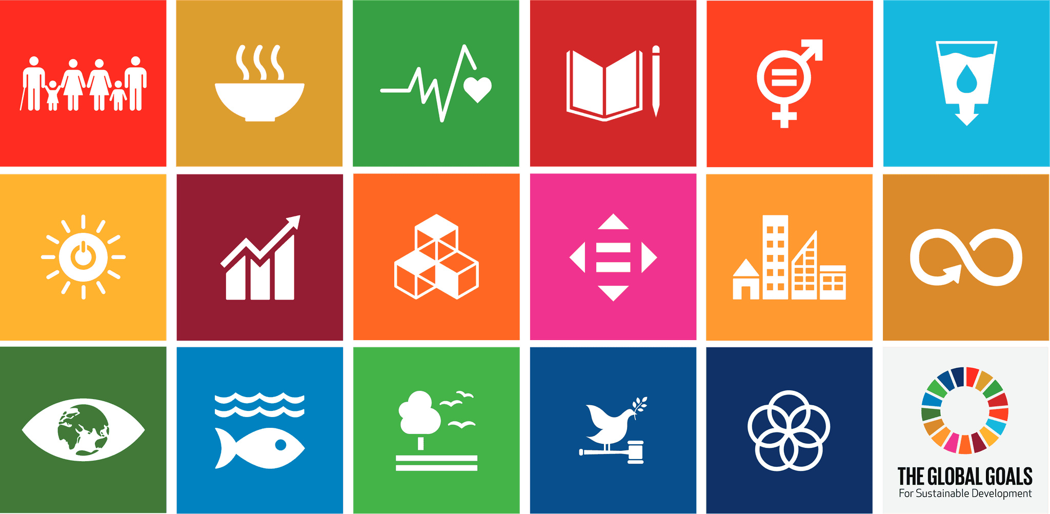
The design process commenced by leveraging established elements, including the existing logo, the Sustainable Development Goals (SDG) color scheme, and the central concept of the wheel. These foundational components were essential in guiding the redesign, ensuring alignment with the visual identity of the Sustainable Development Goals.
The design process commenced by leveraging established elements, including the existing logo, the Sustainable Development Goals (SDG) color scheme, and the central concept of the wheel. These foundational components were essential in guiding the redesign, ensuring alignment with the visual identity of the Sustainable Development Goals.


Redesigned screens
Redesigned screens
The redesign of the leader page features individual cards for each leader, enabling users to explore their stories in greater depth through interactive pop-up sections that unveil details about their missions and impacts.
This approach effectively addresses a significant issue with the previous homepage, where information was presented all at once. Many users tended to stop scrolling after viewing only a few leaders, leading to important narratives being overlooked.
The redesigned page features individual cards for each leader, enabling users to explore their stories in greater depth through interactive pop-up sections that unveil details about their missions and impacts. This approach effectively addresses a significant issue with the previous homepage, where information was presented all at once. Many users tended to stop scrolling after viewing only a few leaders, leading to important narratives being overlooked. By implementing this card-based design, we not only enhance user engagement but also ensure that each leader's story receives the attention it deserves, encouraging users to interact with the content more fully and fostering a deeper understanding of the initiative's impact.