ATB Mobile
ATB Mobile
At a Glance
At a Glance
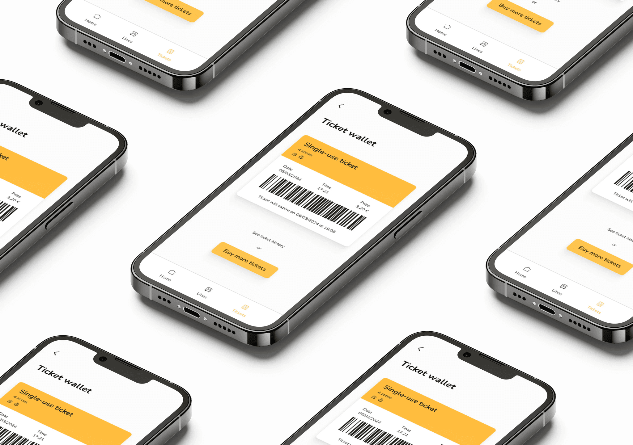
Comprehensive redesign of the ATB Mobile app, which serves as the digital interface for managing urban public transport in Bergamo. This project aimed to enhance user engagement and streamline the overall travel experience for commuters.
Comprehensive redesign of the ATB Mobile app, which serves as the digital interface for managing urban public transport in Bergamo. This project aimed to enhance user engagement and streamline the overall travel experience for commuters.
My role
My role
Product Designer - user research, visual, UX/UI, interaction, design system, wireframing
Product Designer - user research, visual, UX/UI, interaction, design system, wireframing
Team
Team
Rubina Berti
Rubina Berti
Timeline
Timeline
Jan. 2024 - Feb. 2024
Jan. 2024 - Feb. 2024
Tools
Tools
Figma, Framer, Illustrator
Figma, Framer, Illustrator

Problem statement
Problem statement
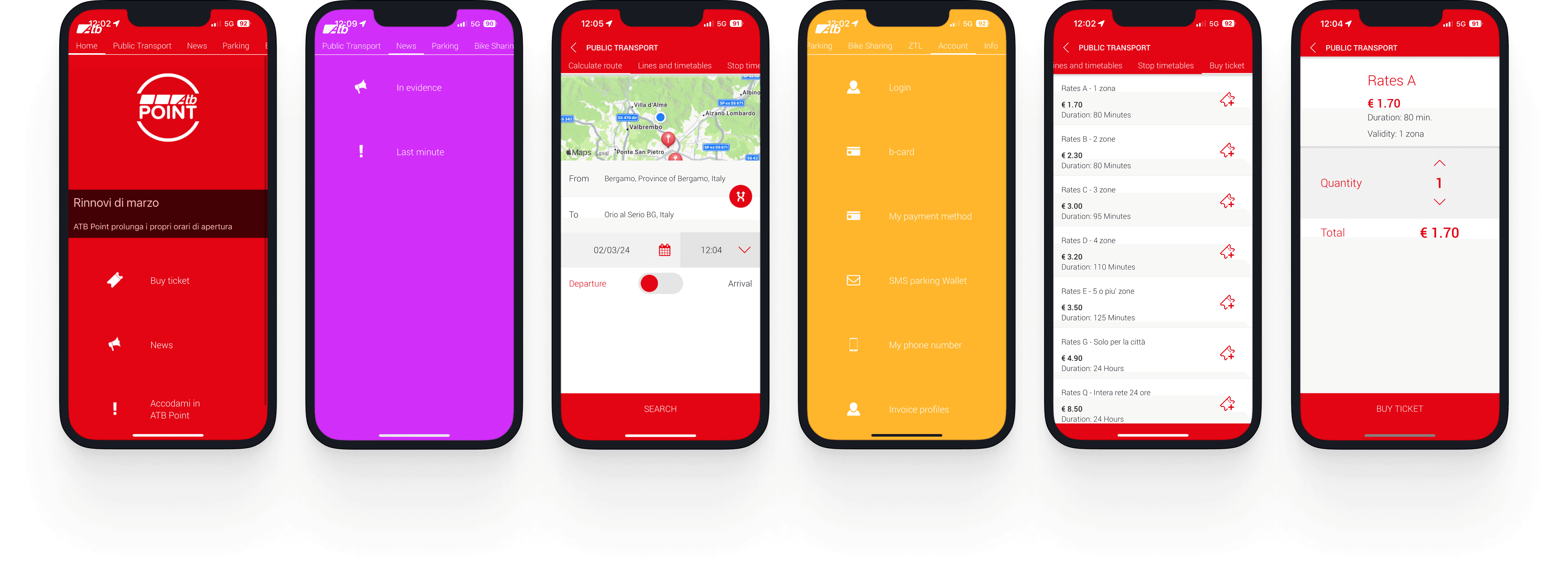
The current app's UX demands a high cognitive load due to a complex and disorganized structure. Users struggle to locate services as a result of an overly long menu, unclear navigation flow, and inadequate content hierarchy. Additionally, the app lacks a visually appealing design and effective visual cues, further hindering intuitive interactions and causing frustration.
The current app's user experience necessitates a high cognitive load for users attempting to locate desired services. This challenge arises from a lengthy and disorienting menu structure, a convoluted navigation flow between pages, and a lack of hierarchical categorization of content. Additionally, the app lacks a visually appealing layout and effective visual guidance, further complicating user interactions.

Understanding the User
Understanding the User
The research aimed to address several specific questions that would inform the redesign of the interface. To establish clear objectives, I focused on the following key inquiries:
How do users navigate within the city, and what are the steps involved in purchasing a ticket for public transport?
What emotions do users experience at each stage of the ticket purchasing process?
Do users encounter any challenges when purchasing a ticket or utilizing other services offered by ATB Mobile?
Are there features or improvements users wish to see in the process?
What suggestions do users have to simplify and enhance their experience during this process?
These questions were instrumental in guiding the research and ensuring that the redesign aligns with user needs and expectations.
Insights
Insights
From a qualitative research, three main common points stood out:
Difficulty to Navigate: Users struggle to find the service they are looking for. The app is not built intuitively and there is not attention to UX. Creating a better categorization in the menu and a better hierarchy in the pages can help the user to move within the app.
Difficulty to navigate: Users struggle to find the service they are looking for. The app is not built intuitively and there is not attention to UX. Creating a better categorization in the menu and a better hierarchy in the pages can help the user to move within the app.
Difficulty to Navigate: Users struggle to find the service they are looking for. The app is not built intuitively and there is not attention to UX. Creating a better categorization in the menu and a better hierarchy in the pages can help the user to move within the app.
Lack of purchase options: Users are limited regarding purchase options. Different users wants different services, some may need a single ticket, other a carnet and some more a monthly subscription. Introducing this feature will provide user a better UX experience.
Lack of Purchase Options: Users are limited regarding purchase options. Different users wants different services, some may need a single ticket, other a carnet and some more a monthly subscription. Introducing this feature will provide user a better UX experience.
Challenges in ticket activation post-purchase: Many users have expressed frustration in their reviews of the current app, highlighting that tickets are activated immediately upon purchase. This lack of flexibility can lead to confusion and dissatisfaction, as it does not allow users to manage their ticket activation according to their schedules.
Lack of Purchase Options: Users are limited regarding purchase options. Different users wants different services, some may need a single ticket, other a carnet and some more a monthly subscription. Introducing this feature will provide user a better UX experience.

Sara, 18-25, student
Regular commuter
Needs information about transportation for her destination, as well as informations about last-minute strikes and announcements.
Would like to purchase monthly passes to save on tickets.

Sara, 18-25, student
Regular commuter
Needs information about transportation for her destination, as well as informations about last-minute strikes and announcements.
Would like to purchase monthly passes to save on tickets.

Sara, 18-25, student
Regular commuter
Needs information about transportation for her destination, as well as informations about last-minute strikes and announcements.
Would like to purchase monthly passes to save on tickets.

Leo, 30-50, tourist
Occasional commuter
Needs information for his destination, he does not have local currency so he needs to pay online for the ticket.
He want to purchase daily ticket and/or weekend pass. He doesn't speak italian.

Leo, 30-50, tourist
Occasional commuter
Needs information for his destination, he does not have local currency so he needs to pay online for the ticket.
He want to purchase daily ticket and/or weekend pass. He doesn't speak italian.

Leo, 30-50, tourist
Occasional commuter
Needs information for his destination, he does not have local currency so he needs to pay online for the ticket.
He want to purchase daily ticket and/or weekend pass. He doesn't speak italian.
Benchmark
Benchmark
About
About
Strenght
Strenght
Weaknesses
Weaknesses
Atm Milano
Atm Milano
Search for a place, line or stop and to save favorite stops. Customizable map.
Search for a place, line or stop and to save favorite stops. Customizable map.
No update section.
No update section.

Tfl Go
Tfl Go
Step-free mode allows to see step free stations on the map and plan accessible journeys.
Step-free mode allows to see step free stations on the map and plan accessible journeys.
Absence of in app purchases.
Absence of in app purchases.

Copenhagen Subway Map
Copenhagen Subway Map
Wait time feature. General metro work schedule.
Wait time feature. General metro work schedule.
Long list of stops without possibility to search or interact.
Long list of stops without possibility to search or interact.

Bonjour RATP
Bonjour RATP
Save favorite addresses. Live timetables. Traffic at a glance. Customizable map.
Save favorite addresses. Live timetables. Traffic at a glance. Customizable map.
Horizontal line layout PDF difficult to visualize.
Horizontal line layout PDF difficult to visualize.
Redesigning the ticket purchase experience
Redesigning the ticket purchase experience
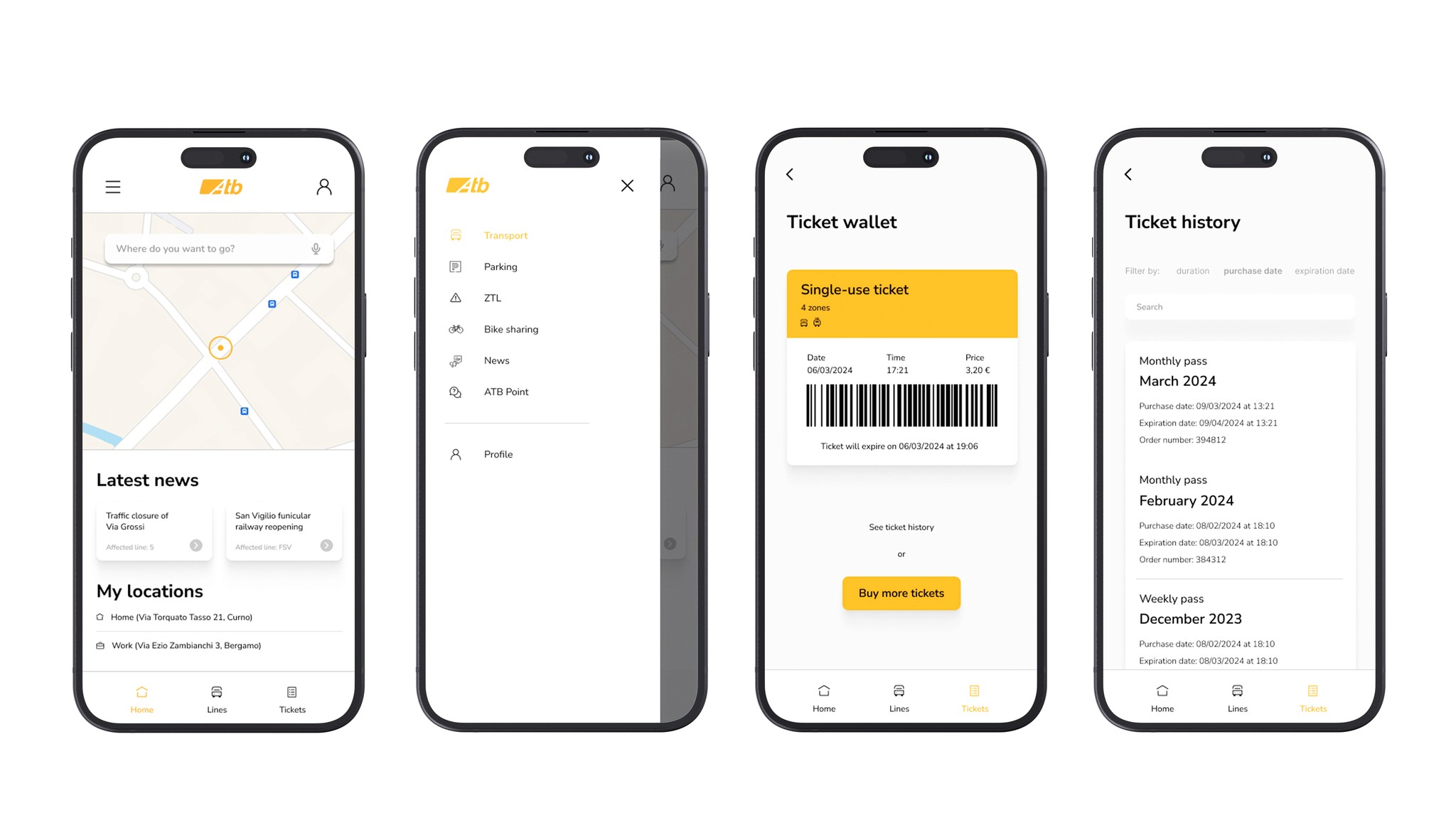
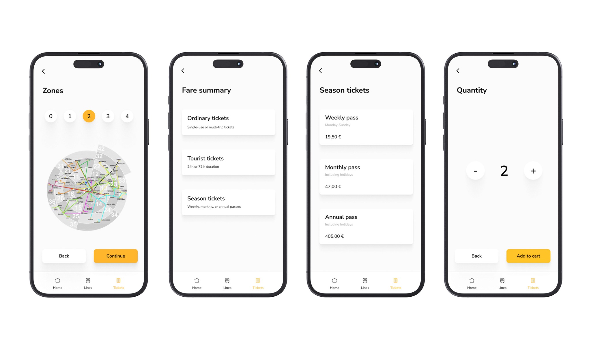
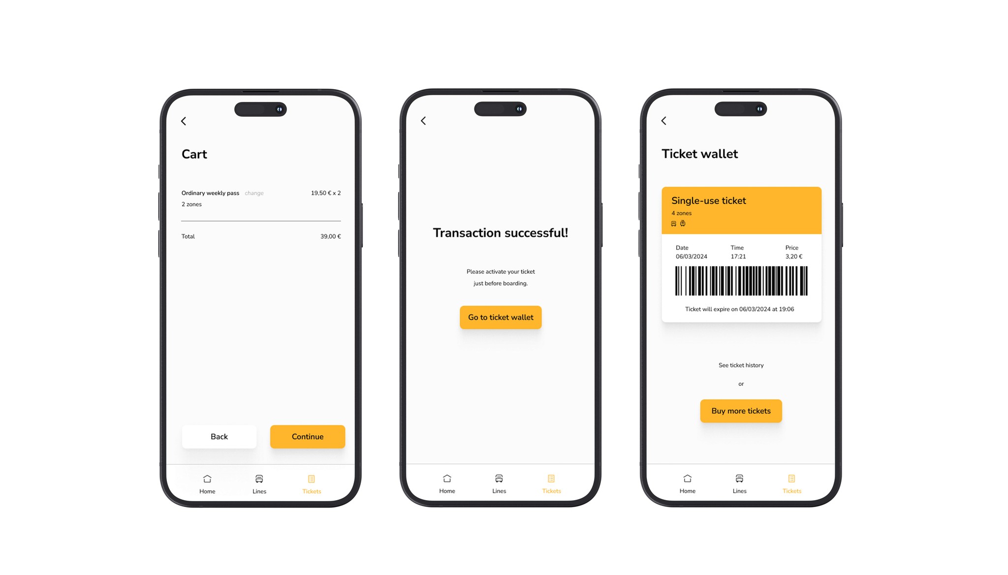
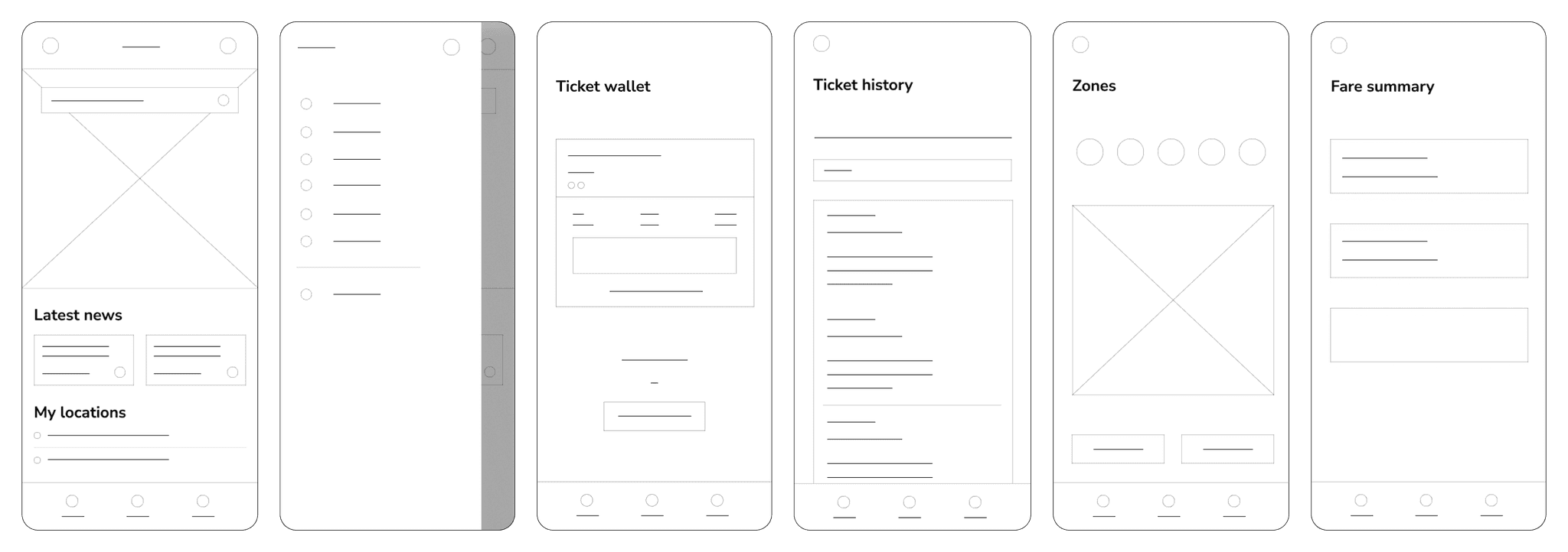
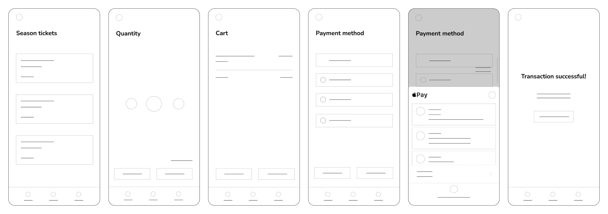
The redesign process prioritized streamlining the ticket purchasing experience. By focusing on enhancing usability and efficiency, the goal was to simplify each step, making it easier for users to navigate and complete their transactions smoothly. This approach aimed to eliminate unnecessary complexity, ensuring a more intuitive and satisfying purchasing journey for all users.
The redesign process prioritized streamlining the ticket purchasing experience. By focusing on enhancing usability and efficiency, the goal was to simplify each step, making it easier for users to navigate and complete their transactions smoothly. This approach aimed to eliminate unnecessary complexity, ensuring a more intuitive and satisfying purchasing journey for all users.


Final design
Final design
